
When I was in middle school, we took a trip out west, into the mountains of Colorado. Being from the flat-lands of Wisconsin, I had a lot of love for scenic water, but most of it is still and lake-like. So, I was thrilled when we drove into Denver, seeing the front line looming large behind the skyscrapers was AMAZING! But it wasn’t until we drove into the mountains that I really became inspired by the colors that happen in conditions that are dry. The scrubby grass, the vibrant reds, and purples working together under a sky with clouds in colors that I have never seen before.
Therefore, I decided to create a pastel landscape representing these colors. First came the purple mountain majesty that represents the background of the mountain ranges.

Three different colors of purple are used to create the mountain range
Then came the red mountains that are in the foreground. I really like this color contrast, even though it seems extreme, it really represents the mountains.
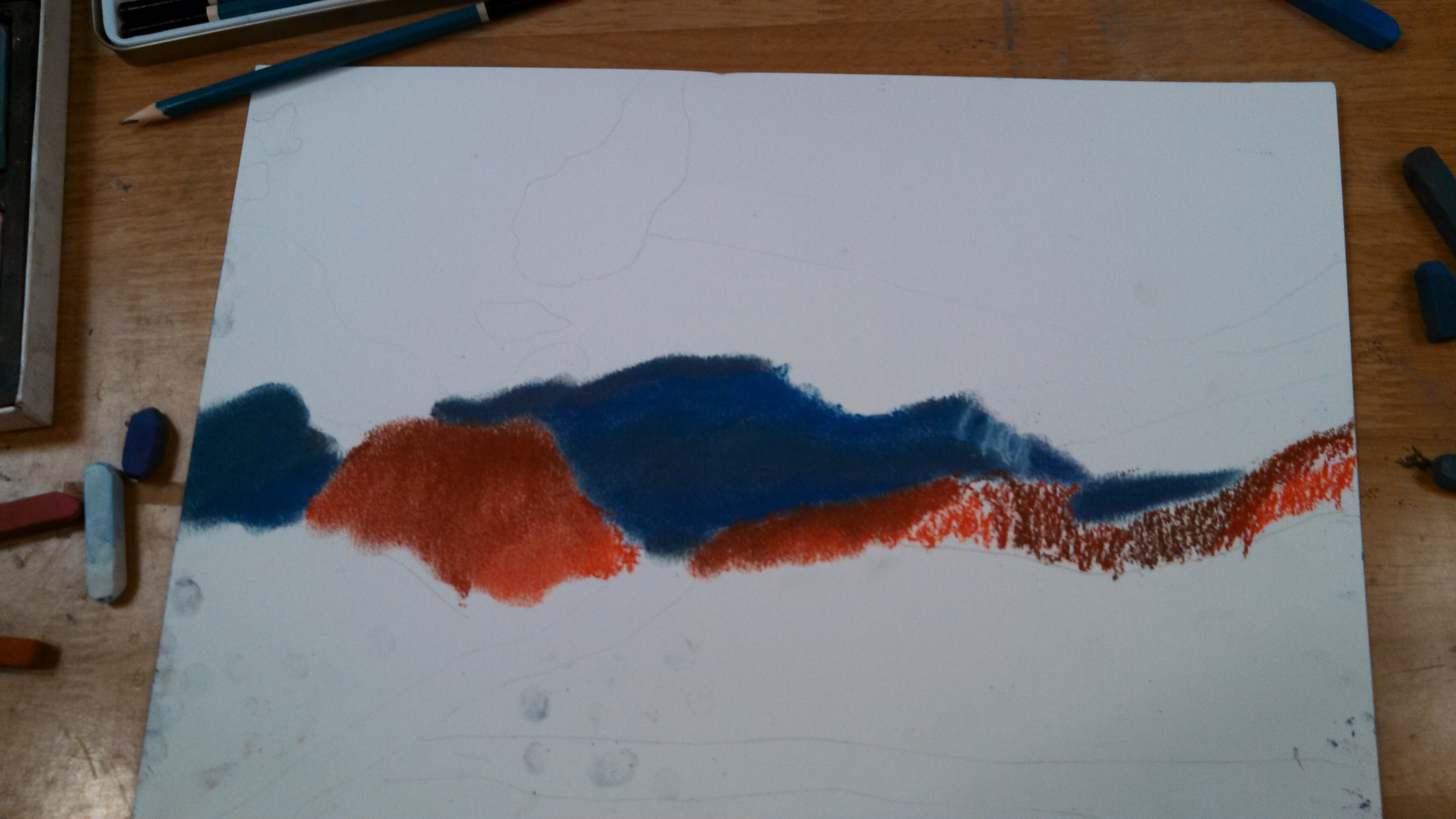
The foothills are red, orange, and maroon.
After the mountains are completed, it is imperative to add the brown and tan colors that represent the soils in front of the mountains, as well as the yellow section that represent the dried river beds and pathways that water flows in the rain.

The foothills are brown and tan, with sections of yellow pathways.
Once the base color is laid down, it is time to add the scrub-like vegetation that protects the soils.

Using hard pastels and straight lines, I added the bushes and scrub to the hills.
Then I finish up by adding the colors for the sky. First, a light yellow, followed by a darker yellow. Then I added some of the blues, light blues, and light purples, which represents a storm cloud. Then several layer of browns, grays, and purples were used to finish off the clouds.
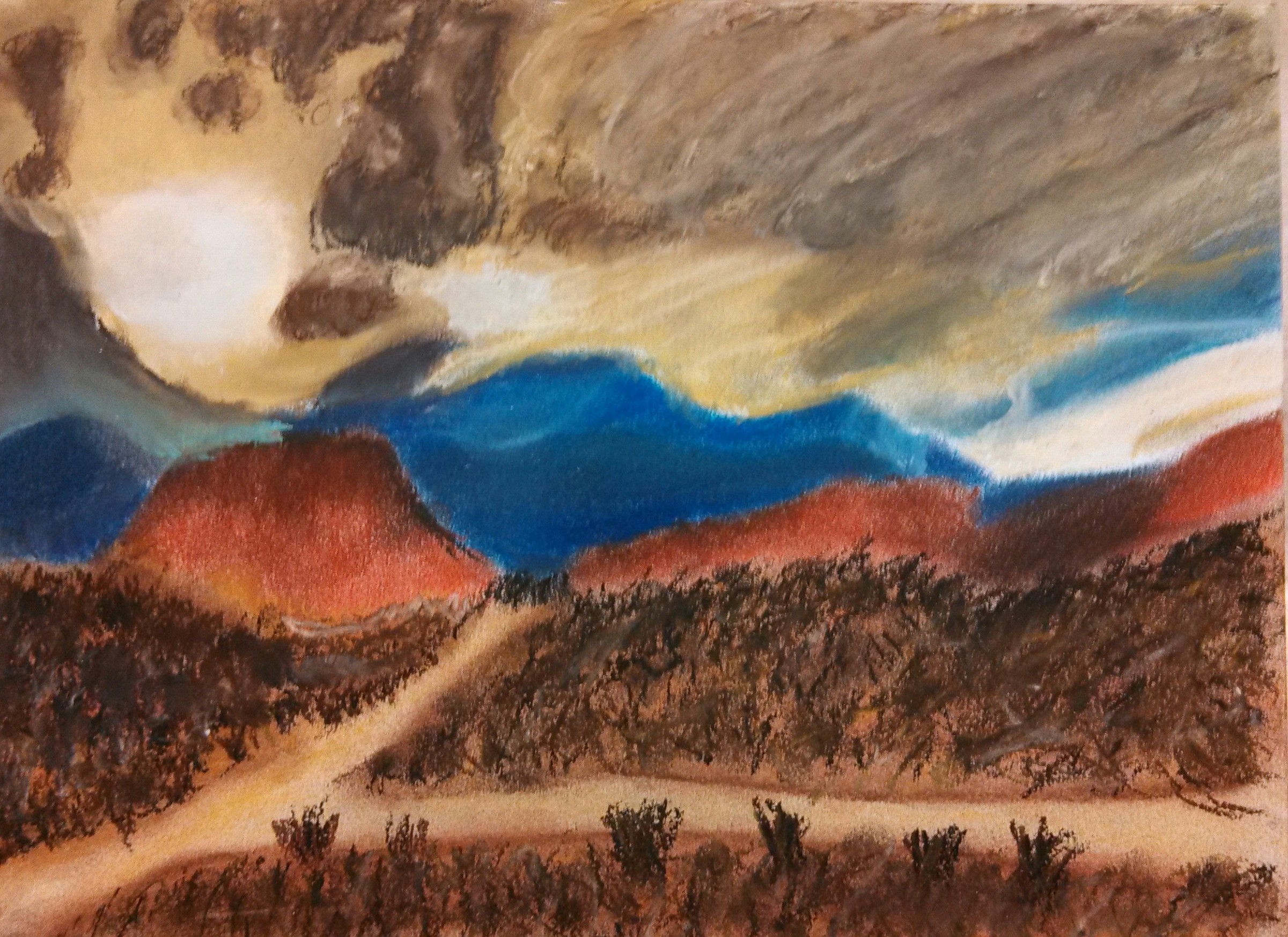
They sky is several layers of yellow, blue, light purples, and browns.
I really hope that you guys like it!
